
About Me
Hi! I'm Modupe and I’m a Data & Insight Analyst who specialises in transforming complex and fragmented data into clear insights that support better decisions.I love simplifying complexity, building dashboards that tell a story, and making data understandable for both technical and non-technical stakeholders. My focus is turning raw data into meaningful insight, so organisations can improve performance, increase efficiency and drive measurable business outcomes.I’ve worked across different industries including finance, healthcare, logistics, energy and e-commerce, and I enjoy solving real business problems through analytical thinking, data modelling, automation and visual reporting.Data is more than numbers for me, it’s a tool for clarity, strategy and impact.
Skills

Excel | SQL | Power BI | Tableau | LookerStudio | Power Automate | PostgreSQL
Data Visualization
Data Analytics
Data Modelling
Stakeholder Management
Team collaboration
Report Development
Projects
SQL | POWER BI
Customer Churn & Retention Analysis Dashboard for Retail Banking
Analysed customer churn in a retail bank by using SQL to identify churn patterns and risk segments, and built Power BI dashboards to visualise key churn drivers and guide retention decisions.


LOOKERSTUDIO | Excel
Optimising employee performance and benefits using data-driven insights.
Analysed workforce performance and employee benefits using Looker Studio to uncover skill gaps, identify underperformance areas, and provide real-time insights that support HR and CEO decision-making to drive employee development and organisational growth.
Power BI | Power Automate | Excel
Using SDOH analytics to address healthcare disparities.
Analysed SDOH data to centralise health insights, automated workflows using Power Automate, and built Power BI dashboards to visualise real-time metrics and support targeted health equity intervention decisions.

Tableau | Google Sheet
Detecting abnormal energy spikes to reduce energy waste.
Analysed household energy usage data to detect abnormal consumption spikes, and built interactive Tableau dashboards to classify anomaly types, trigger proactive alerts, and reduce overall energy waste using Google Sheets as the data source.


PostgreSQL | Power BI
Improving brand reputation with social media analytics.
Analysed social media conversations using PostgreSQL to assess sentiment and detect potential crises, and built Power BI dashboards to monitor trends, prioritise customer issues, and strengthen brand reputation across the consumer electronics market.
Excel
Optimising Order Fulfillment
Analysed order fulfillment performance to eliminate backlog issues and improve logistics efficiency, and built an interactive Excel dashboard with automated KPI calculations and Office Scripts to monitor delivery progress and support data-driven operational decisions.

Excel | Backlog
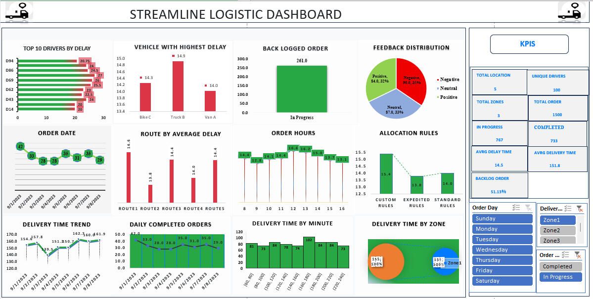
Project: Optimizing Order Fulfillment for Streamline Logistics Solutions
This project analyses the order fulfillment process to eliminate backlogs, improve logistics efficiency, and enhance operational performance.
________________________________________
Here Are the Questions I was Interested in Answering:
1. What are the major bottlenecks causing backlog and delays?
2. Which order categories contribute the most to late fulfillment?
3. How long does it take on average to complete an order from request to delivery?
4. What improvements can reduce order delays and operational costs?
________________________________________
I Took the Following Steps to Create My Analysis:
1. Collected and cleaned the dataset, preparing it for analysis in Excel.
2. Built an interactive Excel dashboard to track order performance metrics.
3. Automated KPI calculations (e.g., completion rate, avg delivery time) using formulas and logic.
4. Used Office Scripts to generate automated KPI summary reports.
5. Formatted all dashboard sections for stakeholder-friendly insights and visibility.
________________________________________
Here Are My Key Takeaways:
1. Backlogs were primarily driven by long processing cycles for large order categories.
2. Resource allocation gaps caused inconsistent completion rates during peak days.
3. Automating KPI calculations improved reporting accuracy and reduced manual effort.
4. Visualising fulfillment stages gave stakeholders earlier insight into delay points.
________________________________________
The dashboard is fully interactive and allows teams to monitor performance trends, drill down into specific order types, and make faster operational decisions to drive supply chain efficiency.
________________________________________
Tools Used: Excel, Office Scripts
Specialisation Area: Supply Chain & Logistics Analytics
Watch the video to explore the complete interactive dashboard
PostgreSQL | Power BI
Project: Enhancing Brand Reputation through Social Media Sentiment Analytics
This project focuses on analysing customer conversations across social media to help AfriTech Electronics detect reputation risks early, improve customer satisfaction, and strengthen brand perception in the consumer electronics market.
________________________________________
Here Are the Questions I Was Interested in Answering:
1. What are customers saying about the brand across social platforms?
2. Which product categories generate the highest volume of negative sentiment?
3. What types of issues (service, product defects, delivery delays, billing) drive the most complaints?
4. How often do early crisis signals appear before they become a major reputation issue?
________________________________________
I Took the Following Steps to Create My Analysis:
1. Collected and imported social media conversational data into PostgreSQL for preparation and sentiment analysis.
2. Tagged conversations by sentiment group (positive, neutral, negative) and categorised key complaint themes.
3. Built Power BI dashboards to visualise sentiment trends, issue volume, and brand risk areas over time.
4. Created filters and drilldown paths to identify specific conversation clusters and root causes.
5. Generated insight summaries to support Marketing, PR, and Customer Experience teams for faster response actions.
________________________________________
Here Are My Key Takeaways:
1. Negative sentiment was concentrated around product recalls and slow customer support response times.
2. Competitors gained advantage by amplifying these issues publicly, which accelerated customer distrust.
3. Early detection allowed recommended interventions before crises escalated.
4. Prioritised themes guided which issues should be addressed first to protect brand image and retain customers.
________________________________________
Tools Used: PostgreSQL, Power BI
Specialisation Area: Brand Reputation & Social Media Analytics
Watch the video to explore the complete interactive dashboard
Tableau | Google Sheet
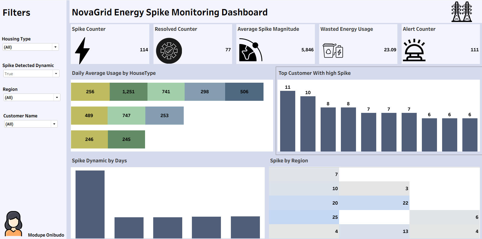
Project: Detecting Abnormal Energy Spikes to Reduce Energy Waste
This project analyses household smart meter data to detect abnormal energy consumption spikes, classify anomaly types, and help NovaGrid Energy reduce energy waste while improving customer experience.
________________________________________
Here Are the Questions I was Interested in Answering:
1. Which households are experiencing abnormal usage spikes and when do they occur?
2. What types of factors (appliance issues, behavior shifts, infrastructure) are driving these spikes?
3. How can proactive alerts influence users’ energy consumption behavior?
4. Can energy waste reduction be measured in post-intervention?
________________________________________
I Took the Following Steps to Create My Analysis:
1. Imported and organised household energy data from Google Sheets.
2. Identified abnormal consumption patterns and segmented anomaly types.
3. Built Tableau dashboards to visualise real-time spikes and drill down into individual usage patterns.
4. Created calculated fields and KPI indicators to measure before vs after intervention impact.
5. Summarised insights to support operational teams and reduce customer support escalations.
________________________________________
Here Are My Key Takeaways:
1. Majority of spikes were linked to faulty appliances running continuously without user awareness.
2. Proactive early alerting significantly reduces unnecessary consumption and billing shocks.
3. Operational visibility gave support teams faster diagnostic clarity, reducing investigation time.
4. Clear customer education + insight visualisation helped build trust and reinforce brand sustainability goals.
________________________________________
Tools Used: Google Sheets, Tableau
Specialisation Area: Energy & Utilities Analytics
Watch the video to explore the complete interactive dashboard
Power BI | Power Automate | Excel
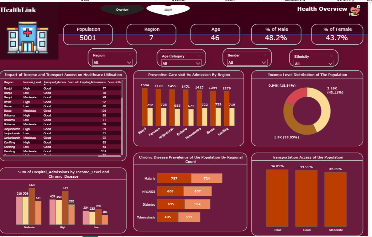
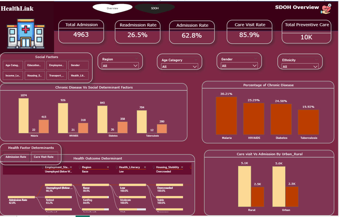
Project: Leveraging SDOH Analytics to Address Healthcare Disparities
This project integrates clinical and socioeconomic datasets to provide a centralised view of Social Determinants of Health, enabling HealthLink Analytics to deliver real-time insights and support targeted interventions in underserved communities.
________________________________________
Here Are the Questions I Was Interested in Answering:
1. Which social and demographic factors most significantly influence poor health outcomes?
2. How can centralising siloed healthcare data improve decision-making for underserved populations?
3. Can automated workflows reduce manual processing delays and errors in health reporting?
4. Which regions and communities are most impacted, based on geospatial disparities?
________________________________________
I Took the Following Steps to Create My Analysis:
1. Integrated clinical, demographic, and SDOH data sources into a centralised structure.
2. Used Power Automate to eliminate manual processing and automate data refresh workflows.
3. Built Power BI dashboards to visualise health equity metrics, risk areas, and geospatial distribution.
4. Created KPI indicators and filters to compare community needs and prioritise intervention zones.
5. Summarised insights to support public health stakeholders with resource allocation and decision-making.
________________________________________
Here Are My Key Takeaways:
1. Data centralisation significantly improved visibility into root drivers of health inequity.
2. Automated workflows reduced reporting time and lowered human processing errors.
3. Real-time dashboards enabled earlier identification of health trends and rising risk indicators.
4. Geospatial visuals empowered targeted allocation of interventions and funding by region.
________________________________________
Tools Used: Power Automate, Power BI and Excel
Specialisation Area: Healthcare Data Analytics
The screenshot below shows the final centralised HealthLink SDOH dataset after integrating multiple raw data sources including demographic, social, and health indicator files, into a single, cleaned table in Power BI (Power Query).During transformation, redundant columns were removed, missing values were handled, and key attributes such as Age, Gender, Ethnicity, Region, Urban/Rural classification, and Transportation access were standardised.This centralised dataset now serves as a unified foundation for analysing Social Determinants of Health (SDOH) across different regions, enabling accurate insights into population health disparities, accessibility, and living conditions.

Power Automate Workflow OverviewThe screenshots display the automated data integration flows built in Microsoft Power Automate for each HealthLink dataset, Demographic, Social Health Factors, Health Indicators, and Gambia Region.Each flow automatically triggers when a new response is submitted, retrieves response details, updates the relevant Excel table, sends a confirmation email, and refreshes the linked Power BI dataset.This automation eliminated manual updates, ensured real-time data synchronization, and streamlined the end-to-end data pipeline for the centralized SDOH analytics dashboard.


LOOKERSTUDIO | Excel


Project: Optimising Employee Performance and Benefits using Data-Driven Insights
This project analyses employee performance, engagement, and benefit usage to provide HR leadership with real-time visibility and support data-driven decisions that improve development, performance management, and benefit optimisation at Tech Innovators Inc.
________________________________________
Here Are the Questions I Was Interested in Answering:
1. Which employees or departments are underperforming, and what factors contribute to it?
2. Which training programs and development initiatives produce the biggest performance lift?
3. Which employee benefit programs drive the most usage and satisfaction, and which are low value?
4. How can executives take action faster using real-time employee performance insights?
________________________________________
I Took the Following Steps to Create My Analysis:
1. Consolidated performance, benefit usage, and demographic datasets for employee level visibility.
2. Segmented employees by performance rating, engagement score, department, and benefit usage.
3. Built Looker Studio dashboards to visualise performance trends, benefit consumption patterns, and improvement areas.
4. Highlighted relationships between benefit usage, engagement, and performance outcomes.
5. Created stakeholder-friendly summaries to support leadership decisions and redesign benefits strategy.
________________________________________
Here Are My Key Takeaways:
1. High-performing teams showed strong alignment with training completion and higher engagement scores.
2. Several benefits were underutilised despite high cost contribution indicating poor ROI and misalignment with needs.
3. Real-time visualisation empowered earlier interventions for underperformers and improved talent pipeline planning.
4. Data-driven redesign of benefits ensures better budget allocation and measurable performance uplift.
________________________________________
Tools Used: Looker Studio
Specialisation Area: HR Analytics & Workforce Optimisation
SQL | POWER BI
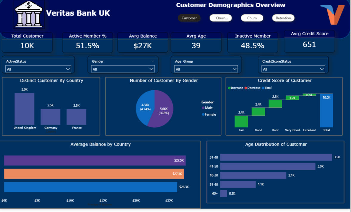
Project: Customer Churn & Retention Analysis for Veritas Bank
This project analyses customer behavior across multiple regions to identify drivers of churn, segment risk groups, and provide insights to help Veritas Bank improve retention strategies across the UK, Germany, and France.
________________________________________
Here Are the Questions I Was Interested in Answering:
1. What common characteristics and patterns exist among customers who churn?
2. Which countries and customer groups show the highest churn risk and why?
3. How does account behaviour differ across active vs churned users?
4. How can segmentation support targeted retention interventions?
________________________________________
I Took the Following Steps To Create My Analysis:
1. Queried the dataset in SQL to profile churned vs active customers and derive behavioural risk patterns.
2. Created customer segmentation groups based on tenure, product usage, credit score status, and engagement level.
3. Built Power BI dashboards to visualise churn KPIs, country level breakdowns, and churn risk distribution.
4. Highlighted common churn indicators to support strategic retention planning.
5. Generated insights to guide targeted offers, communication, and personalised retention actions.
________________________________________
Here Are My Key Takeaways:
1. Highest churn behaviour was concentrated among low engagement customers in France and Germany.
2. Customers with lower credit scores, lower tenure, and limited product usage showed elevated churn risk.
3. Churn patterns varied by country, indicating the need for region-specific strategies rather than a single global retention model.
4. Power BI dashboards enabled faster executive visibility which supports proactive churn prevention interventions.
________________________________________
Tools Used: Microsoft SQL Server, Power BI
Specialisation Area: Customer Analytics & Retention Strategy
Watch the video to explore the complete interactive dashboard